
recently i wrote a series of posts that were aimed at helping marketers think about their email strategy. after that came a post detailing how 5 million businesses have migrated to google apps for their email and how that migration and presence is changing the way we construct emails. this is the beginning of a new series, intended to help marketers develop better looking emails for gmail, strategies for getting into the gmail inbox, gmail quirks, and how to better address the industry changes that are being influenced by gmail. for the first topic, we'll start simple - gmail image gaps.
rendering... why start with this? i think it's pretty simple... good looking messages look professional and help get your message to your readers. remember that content is king and an image is worth a thousand words. to me properly rendered images are just as important to your email as deliverability, and while you can do a lot to influence deliverability, there is even more you can do to ensure your messages render properly, just by knowing the quirks of the email clients out there.
the"g" in gmail stands for gaps
 |
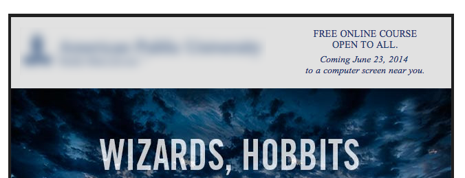
before: the black box at the top of the header graphic
is a "gap".
|
in the example to the left (logo blurred to protect the innocent), the "gap" is the black bar at the top of the email. this is what the code for this image most likely looks like:
<img src="image path" width="640" height="150" border="0" />
i'm sure you're thinking well to fix that just put 'valign="top"' on the table cell, doing that would have only put the gap at the bottom of the cell. good thought, but in reality there are a few ways to work around or with (depending on your feelings about gmail) these gaps.
branding opportunity
the first is to use the gap as a way to introduce a subtle nod to your brand. use a different color as the background color in the table cell. this method works well when the image is the full width and not part of a larger image that has been sliced up to speed rendering the email and aid in inbox delivery.
mind the gap with code
the second method, which is probably the better of the two, is by styling the image with the following inline css:
<img style="display:block;" src="image path" width="640" height="150" border="0" />
 |
after: adding image styling removes those gaps in
your images
|
using the "display:block;" inline css method will remove the extra space around your image, especially when you have multiple images side-by- side.
it's important to remember that when addressing gmail rendering issues the vast majority of the work-a-rounds rarely impact the rendering behavior of other clients*. meaning, you don't have to come up with additional fixes which could bloat your code.
changing the way we think for emailing
a lot of email marketing professionals use what i like to refer to as a "LCDC" (lowest common design client) benchmark for coding. just a little while ago, this LCDC was outlook. if your emails looked good in outlook (and let's face it, most of us send ourselves tests to our corporate account first when working on layouts and rendering issues), then it looked good in 99% of the other clients. but because gmail is developing a huge presence in the world (not just b2c, but also b2b markets) that LCDC benchmark should now be gmail.
stayed tuned for the next in the series: gmail's new experience enhancements
*while this solution works great for images, you'll want to limit the use of styling other elements of your email with this inline css. putting this on a table or something else can drastically change the look of your email in not only desktop clients, but also in mobile rendering. as always you should employ the first rule of email marketing - test, test, test...then test again.
0 comments:
Post a Comment